
ScrollBar
A highly customizable suite of custom WinForms Scrollbar .NET Controls. Contains both Vertical and Horizontal scrollbars

WinForms ScrollBar Feature Highlights
- Very advanced features, yet very simple to use
- Full customisation of look-and-feel
- Rich design-time experience for development
- Instant replacement for the standard controls
- Supports both orientations - Horizontal and Vertical
- No complex style editors or skinning involved
- No dependency on OS theme specific libraries
- Enjoy setting custom size to the scrollbars
- Can display images for thumb, up/down buttons, etc.
- Supports built-in ContextMenu
- Supports custom renderers (implement your own!)
- Comes with pre-defined themes, ready to use!
- Gives you two more of our .NET controls for use - Scrollable Image viewer, and Scrollable Panel
- Many more features!
A quick peek into some features...
What is Binarymission Custom scrollbar Control?
This is our custom WinForms .NET Control that can work as a ScrollBar, supporting both Vertical and Horizontal orientations, for any .NET scrollable .NET Control.
why would i want to use it?
Have you ever wanted to set up beautiful & colourful scrollbars to your scrollable controls (like panels, etc.) that match up with your application’s colour theme?
Well, then you know by now that it is almost impossible to get that done with .NET Standard Scrollbars without, of course, writing your own scroll controls from scratch.
With Binarymission Scrollbars, you can! Very easily too.
advanced features, rich design-time facilities, yet Simple to use
The Controls come with rich design-time features, and is extremely easy to use.
If you know how to set properties on .NET controls, you are ready to use it.
You would simply drag/drop the controls into your Visual Studio Toolbox, and drag them on to your Form, and set any desired properties and configure the control for use, and simply using it as scrollbars for any other scrollable content control.
You could also run a live view of all user-experience effects, like scrolling, clicking the arrow buttons, moving the scroll box/thumb, all this from the Visual Studio Form design surface itself, so you can see the run-time effects without even running your application.
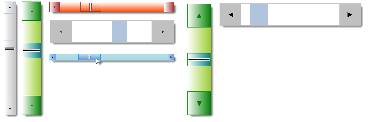
Supports setting custom size
The Controls support setting up custom Width and Height, for the Vertical and Horizontal mode Controls respectively.
You can also specify the exact desired size (and color) for the arrow glyph (when using the default/built-in navigation buttons mode).
Supports using Images for various parts
The Controls, by default, renders various parts of its UI with the built-in custom drawing.
Apart from that, the Controls also support using custom Images.
You could set the various parts such as the Thumb (scroll box), the Gripper, and Arrow scroll buttons to be rendered using your custom images.

More related .NET Controls In The Package - ready for use
To make instant use of our custom WinForms ScrollBar Control, the package contains some useful container controls that comes built-in with the Binarymission custom Scrollbar Controls as their scroll bar, so you do not have to write or wire up any event/code.
These Controls cover most of the use-cases of scrollbar usage as you will find below.
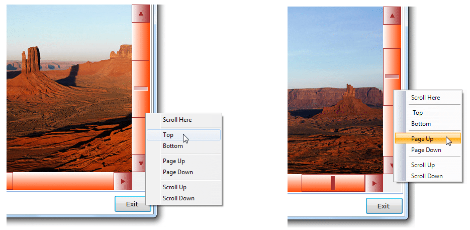
Supports Built-in Scrollbar ContextMenu
The Controls, by default, provides a built-in context-menu that enables ready-to-execute commands for scrolling.
The built-in scroll commands context menu can be set to display in either of the two modes:
- Using standard ContextMenu component
- Using Binarymission extended WinForms Menu component
But of course, you can switch-off the provided default context menu, and provide your own as well.
Instant replacement for the standard Scrollbar controls
This Control instantly replaces the standard .NET WinForms VScrollBar and HScrollBar Controls.
It raises all the very same events (and even more than) that of the stock scrollbar controls raise, so it makes your life easier to use it in your applications.
Unlike the standard .NET ScrollBar Controls, Binarymission custom Scrollbar Controls allows you to custom configure all drawing / rendering aspects of the visual/control, without writing any code (unless you want to take more control, of course).
You can either choose to simply set the appropriate colour properties and set images to let the scroll bar render as you desire, or alternatively even take full control of drawing the core aspects of the Control yourself by plugging in your custom implementation of our renderer interfaces.
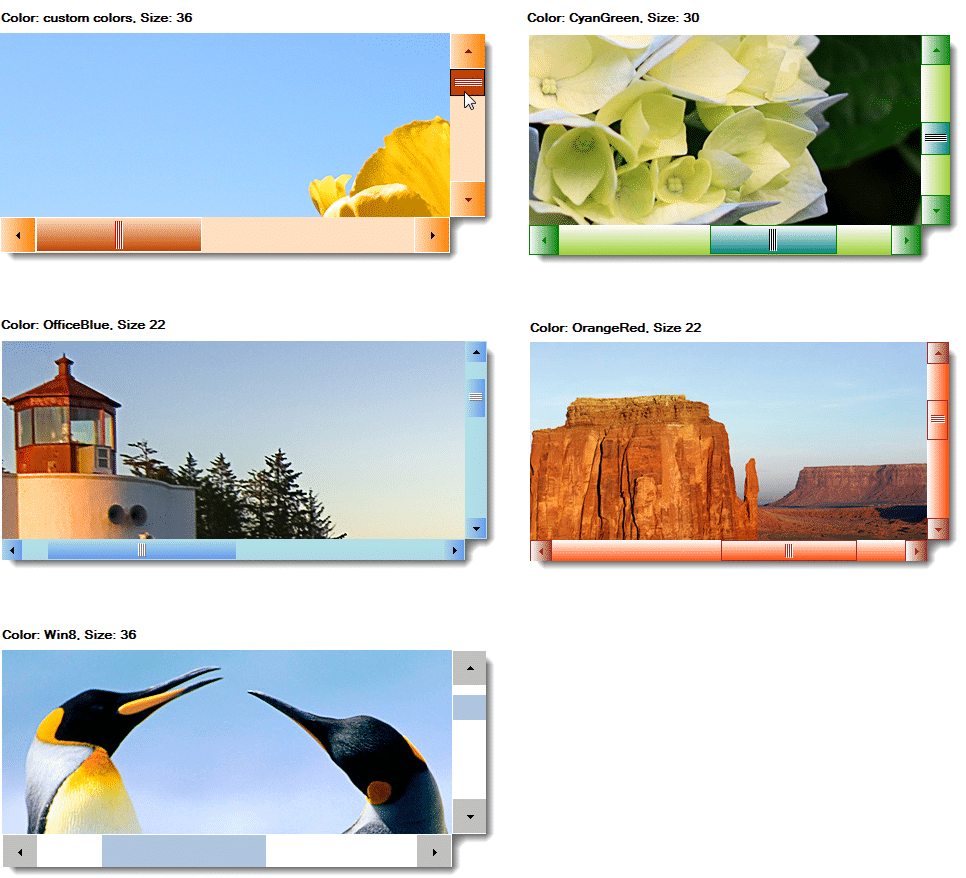
Comes with ready-to-use themes - just simply plug-and-play!
The component provides out-of-the box, the following styles of chrome rendering themes ready for use:
- Windows 10
- GradientBrown
- Office Blue
- Office Black
- Office Silver
- Olive
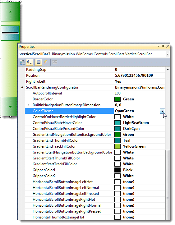
- CyanGreen
- OrangeRed
Custom pluggable Renderers
You could use the simple-to-use properties to set up all the colours size, etc, or alternatively, take full / partial control of drawing the various parts of the our custom scroll bar Controls easily, by plugging-in your own custom renderers.
No dependency on OS theme specific libraries such as uxtheme.dll, etc.
The component is completely custom written in order to provide (out-of-the-box) customisable drawing of the non-client areas, and hence there is no direct dependency on any OS theme specific libraries such as uxtheme.dll.
This means that you can use this library to present cool window forms applications with heavily customised non-client areas as you wish, across any Windows Operating system.
Full Customisation of look-and-feel
The Controls provide simple properties that allow:
- customising the colours of every single aspect of the rendered artefacts viz., Thumb, Track and Scroll Arrow buttons
- customisation of colours for rendering various states like Hot, Pressed, Normal and Disabled
Orientation
The Controls support both orientations – Horizontal and Vertical.
Use cases
You will be able to use thse scrollbar Controls wherever you would normally use the HScrollBar and VScrollBar classes, and use to implement scrolling in containers that do not provide their own scroll bars (or even if they provide their own, you could switch them off and add this Control and wire up the scrolling using the Controls’ properties such as LargeChange, SmallChange, Minimum, Maximum, Position, etc.).