A collection of various powerful and features-rich custom WinForms .NET Controls
UI Controls Feature Highlights
Plenty of WinForms .NET Controls, straight out-of-the-box
Full customisation of look-and-feel
Rich design-time experience supported for easy development
Just drag-and-drop, and it is ready to use!
The Controls listed here are in addition to many of the Controls listed in the Products page.
Clock .NET Control
The Clock Control is a highly customizable custom WinForms .NET control, that displays real-like modern and stylishClocks that you can display in your applications, to show / visualise time in real-time (since the time handles move!)
Features include:
Extensively custimsable – well, make your fancy clock with our Control!
Renders customisable drop-shadows
Allows you to shape the Clock as you desire
Hour, Minute and Second hands are heavily customisable in terms of size, colour, and many more
Supports rendering Glass effects
Configurable border rendering: including configuring thickness,colour and border style
Background painting: using custom colours, including gradient painting
Many many features… the list goes on! Take a look at the screenshots (below)
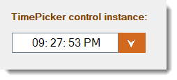
Time Picker .NET Control
The Time-picker Control is a highly customisable custom WinForms .NET control that displays an exotic time display where by your users can pick the time by being able to pick/set individual pieces of the time (the hour, minute, and the seconds parts).
Features include:
Heavily custimsable – every aspect of the time picker artefact can be customised in terms of colour, font, border colour, thickness, and many more.
Renders custom drop-shadows
Configurable border rendering: including configuring thickness,colour and border style
Background painting: using custom colours, including gradient painting
Many many features… the list goes on! Take a look at the screenshots (below)
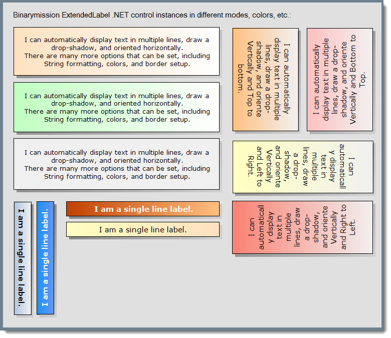
Advanced Label control
This is our custom label WinForms control that supports custom drawn artefacts, and allows you to setup a variety of settings such as display mode, orientation, colours, and many more options.
Features include:
Transparent background rendering
Multiple styles of rendering the labels: includes Horizontal and Vertical
When in Vertical mode, the text drawing can be set to any of the modes: viz., Top-to-Bottom or Bottom-to-Top
Supports UI property type editor in design-mode for setting multi-line string for its Text property
Configurable border rendering: including configuring thickness,colour and border style
Configurable drop-shadow drawing: including drop-shadow colour, depth / length
Background painting: using custom colours, including gradient painting
Post-It style Desktop Notes Control
An outlook style Post-It / note page custom WinForms .NET Control, that would float note tips on the screen.
Features include:
Microsoft Outlook style Post-It note floating window control
Out-of-the-box Window expandable corner gripper for the users to resize the the Control at run-time
Supports Moving of the Note window
Renders Header, Status bar and a choice of either a built-in Textbox or RichTextBox
Supports supplying your own header section for the Note
Supports several built-in Themes colours for rendering the window and other artefacts
Easy to customise the Control (including colours, Images, Fonts and background rendering)
Raises several rich events upon clicking, right-clicking and closing requests for the window
Windows Explorer style Navigation bar Control
This WinForms control presents the look-and-feel of the popular Windows XP navigation bar control.
Features include:
Popular XP Sidebar/Taskbar style Navigation system
Allows Extensive UI customisation of control’s elements
Rich design-time editing experience, and numerous properties to customise the control to your heart’s content
Automatic support for emulating XP theme rendering
HeaderPanel Control
This is our Outlook styled Header panel WinForms control.
Features include:
Multiple rendering modes: Includes Standard, XP and Glass style rendering
Supports Client area expand/collapse capability
Separate Header and Footer areas, header & footer can be rendered in any of the 4 different locations viz., Top, Right, Bottom, or Left
Includes our custom Scrollable container control that comes with its own fantastic features
Header can optionally contain a built-in command-menu area where you can configure and place any custom commands for users’ invocation
Comes with several out-of-the-box Colour themes for ready use
Rich design-time support
Outlook style Date-Picker Control
This is our custom Outlook emulating Date-picker WinForms control.
Features include:
Emulates the look-and-feel and behaviour of the popular Microsoft Outlook DatePicker
Out-of-the-box multiple rendering styles
Built-in null date/time support, including property to set your own custom string to represent that a date has not be currently set / selected
Supports Data-binding – so you can connect to your own data models for two-way binding
Full support for Internationalisation
Supports custom date-time formats, on top of the standard formats Optionally provides customisation command-menus
UI can be extensively customised for all rendering aspects (excepting size, since it has fixed size to emulate Outlook date-picker)
Supports customisation of drop-down calendar buttons
Control’s data feed is XML enabled, so you can feed various date to the control via XML
Built-in validation on date/time date typed-in by your users
Extended tool-tip displays
Highlight dates of your choice, with special colours/formatting
Office style Colour Picker controls
This is an Office style Colour picker WinForms controls suite.
Features include:
Displays Office style Colour picker window as the drop-down, allowing users to select a colour of their choice
Comes built-in with a Flat style Colour Picker ComboBox, and Colour Picker DropDown controls
Support configurable display styles
Just simply drag-and-drop from the toolbox, and its ready to go. The default configuration will automatically work for you
Allows heavy customisation, if you want to customise further
Office style SuperTooltip WinForms Component
Features include:
Office SuperTooltip style appearance and functionality
Rich design-time editing support and Super Tooltip property extensions
Built-in custom written UITypeEditorto enable you to configure its extendeecontrol’s various extended properties
Partial or complete owner-draw support – take full control of the painting process if you want
Display at user defined screen location
Predefined colour schemes, ready to use by simply setting a property
Extensively customise the tooltip by setting up the various / numerous properties available to you
Advanced Tooltips for WinForms
Features include:
Multiple rendering modes: including Balloon, circular, Rounded rectangle modes
Supports automatic adjusted rendering for multi-line support for tooltip body text
Automatic tooltip location management
Includes PointToolTips: This component enables displaying tooltips on any screen location of your choice
Supports customising all aspects of rendering
Predefined colour themes
Rich design-time support
Advanced Menu component for WinForms
Features include:
Includes rendering menu items in groups, and supports rendering group header
Rendering options includes XP, Windows 7 / 10, Office and Glass themes
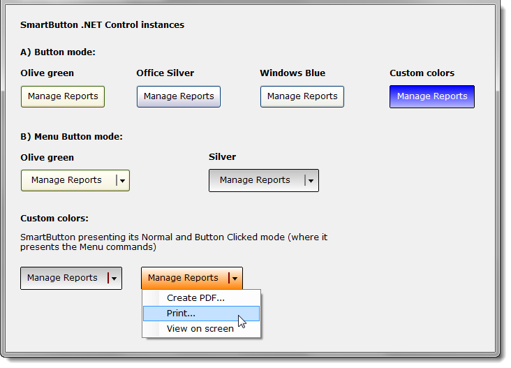
Advanced Button control (SmartButton) for WinForms
Features include:
XP, Vista / Windows 7/10 styled themes (without having to setup the respective OS manifests) even in non-XP / Windows 7/10
Supports rendering as a Glass button
Supports displaying images / icon along with their Alpha-channel information
Includes a special MenuButton style
Numerous properties to heavily customise the control
Rich designer support
Advanced Checkbox, Radiobutton controls for WinForms
Features include:
Numerous properties to heavily customise the controls
Built-in mouse hovering effects
Stylish Numeric and Domain Spinner controls for WinForms
Features include:
Supports customising border colour and the internal spin area rendering colours
Supports several mouse hovering effects
Numerous properties to heavily customise the control
Advanced Textbox control for WinForms
Features include:
Supports customising border colour and styles (including dotted border)
Several mouse hovering effects
Contains an advanced Numeric Text box control
Built-in border blink feature
Numerous properties to heavily customise the control
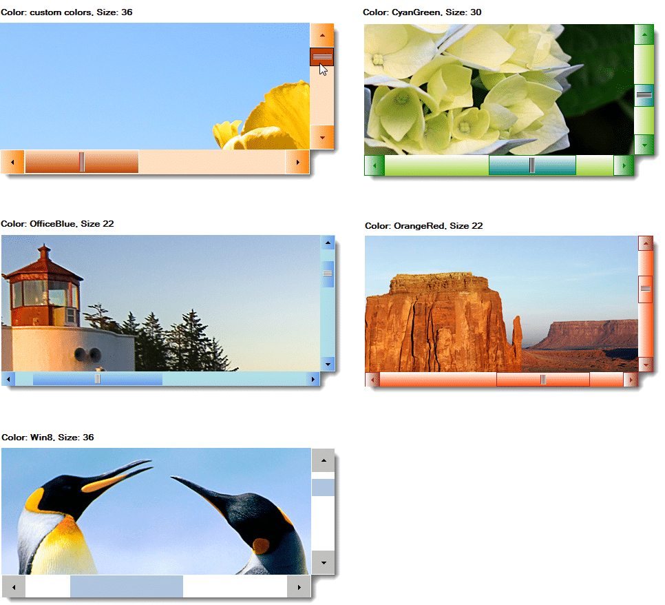
Scrollable PictureViewer Control for WinForms
You could use this custom Control instead of the standard .NET PictureBox Control, and thereby enjoy a more aesthetically beautiful scrollable viewing of images.
Simply drag/drop the Control and set its Image property with a desired image, and you are ready to use it.
See (below) some screenshots of our Scrollable PictureViewer custom Control in action.
Desktop Alert Popup Component
Our Desktop Alert Popup .NET component will instantly enable your WinForms applications with the popular Microsoft Outlook styled popup alerts functionality.
Just with one line of code, you can display “alert” popup windows to your application users.
The component has been developed completely from scratch, implementing custom painting functionality to provide extended GUI effects!
Aquick summary of the Component features includes: