
Virtualizing WrapPanel
World’s first Virtualizing WrapPanel Control. Allows Grouping and Filtering whilst Virtualizing the WrapPanel.
Feature Highlights
- World's first Virtualizing WrapPanel
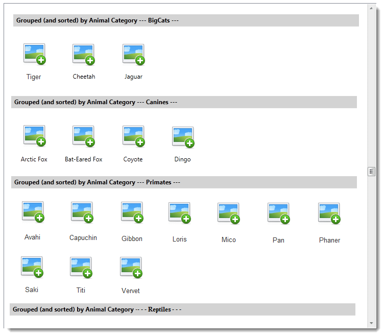
- Grouping of content enabled even when Virtualizing
- Can render group header, and also the ability to customize it
- Supports IEditableCollectionView data sources
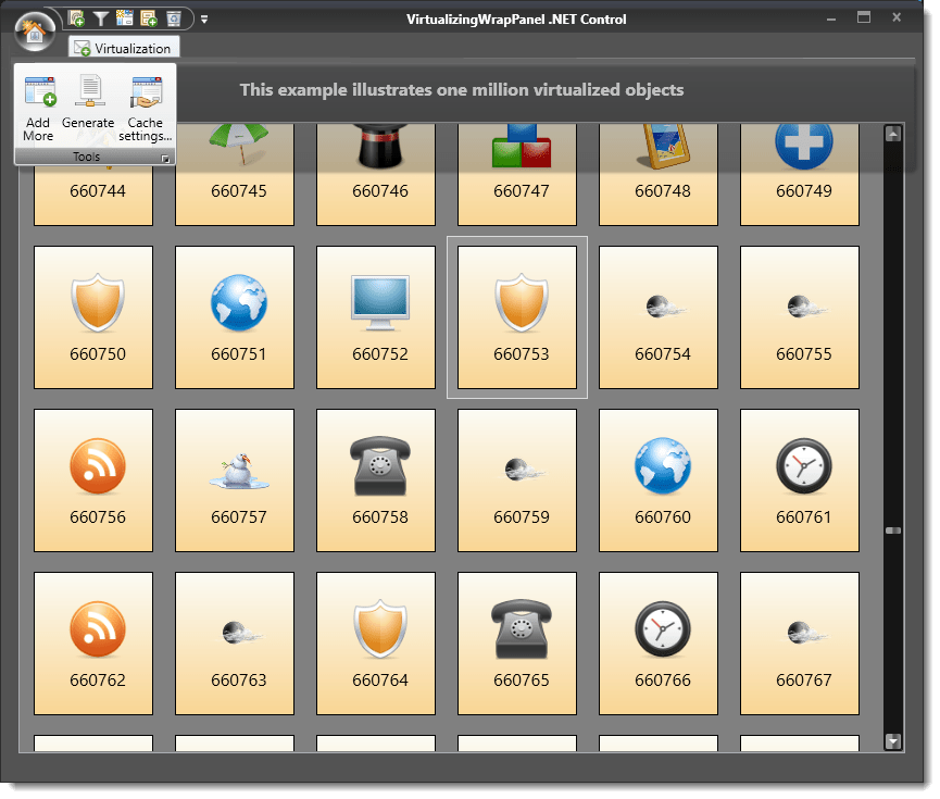
- Automatic virtualization/realisation of items
- Many more features!
A quick peek into some features...
What is Virtualizing WrapPanel all about?
The Control is a UI Virtualization capable WrapPanel control for WPF.
It is extremely helpful in boosting the performance of User-interface and improving the User-experience (UX), especially when you have the need to associate large amounts of data with an ItemsControl that has to display content in an automatic Wrapping fashion.
What does it do?
UI Virtualization
The Control works just like the stock .NET WrapPanel control, but in addition, the control automatically virtualizes, realises, and arranges the associated content, by automatically creating and destroying the containers for the content items on-the-fly.
This means the UI of your ItemsControl or ScrollViewer is completely virtualized, consequently letting you to allow your users to view and scroll through large amounts of visuals / data items very quickly.
Grouping of content during virtualization enabled
The Control supports virtualization even when grouping – i.e. perform virtualization and also continue to render the collection data using custom grouping setup on it.
The Control offers three kinds of header & children content rendering., viz:
Continuation: The grouped data (header and children) will continue to flow one group after the other, wrapping lines in a standard manner
LineBreak: Each group header (and its grouped child items) will start to render in the new row/column
StandaloneRow: Each group header will live in a new row/column, and its children will start to render in the next row/column.
The StandaloneRow mode is similar to LineBreak mode, except that in this mode, the group header will live in its own row/column than the relevant grouped items.
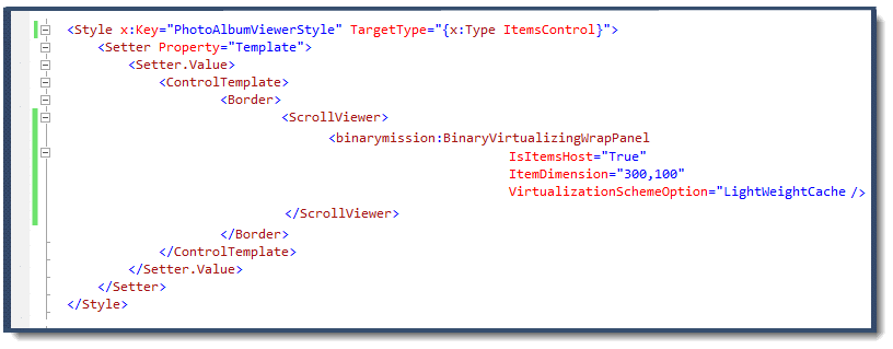
UI Virtualize anything that can be scrolled
The Control can be used to automatically UI Virtualize any content that can be scrolled.
The typical Use-case for this control is to use it as the ItemsPanelTemplate for an ItemsControl, but you can use this control to virtualize any scrollable content, not just only as ItemsPanelTemplate.
For example, you can host it inside a Scrollviewer (as part of an ItemsControl’s ControlTemplate) to UI virtualize the Scrollviewer’s content.
Screenshot of using the control to virtualize the Scrollviewer’s content, as part of the ItemsControl’s ControlTemplate
Customized Group Header Summary Display
- The Control supports drawing a group header summary row
- The group header is fully customisable via custom data template
- A property ItemPositioningMode is also available, with two possible options: Greedy and Safe – to manage the available space for rendering the virtualized child items
Deep Customisation of Drawing the Grouped mode Visuals
The Control supports being able to customise the various drawing aspects of the Grouped mode, giving you the control on rendering up to the pixel level.
The following are some of the rendering aspects that you can control:
- Custom extra spacing between group header row and data item row
- Custom extra spacing between group rendering completion and where the group header row rendering begins
- Should the control render the default item dimension worth of height spacing between group header and data item row
- Should the control render the default item dimension height worth of spacing after a group has been rendered
Should the control render the default extra line before rendering the group header.
Customising the Height of the Group Header
By default, the Control will render the header with a Height of 24.0 units, but you can specify the header height if you are setting up a custom header via your custom data template (as described above).
To support custom height for the header rendering, there is a property in the control named GroupHeaderItemCustomHeight.
Dynamic Injection Of Control Supported
The Control, by default, supports its use directly in XAML -i.e. hosting it inside an ItemsControl or ScrollViewer instance or even using it as a WrapPanel control directly, and be able to transparently use it in a MVVM design-pattern friendly manner.
In addition to that, it also supports some advanced scenarios of usage – i.e. there are scenarios where you would want to dynamically inject the control either via code or swap the control as the panel via some style triggers.
The Control supports such advanced scenarios of usage as well, and you enable this usage by simply setting a property in the control – i.e. IsDynamicConstructionCapabilityEnabled to true.
Supports Transactional Updates, Data Filtering and Sorting
IEditableCollectionView data sources: The control’s virtualization engine will support the transactional edits to the ItemsControl’s items source data, and the control will automatically re-virtualize/realise the contents for rendering in its viewport.
Dynamic update of the viewport, based on Filter and Sort: The Control is capable of dynamic and automatic re-virtualization / realisation of child items for re-rendering in the view port, on dynamically filtered and sorted data (for ICollectionView data sources)
Custom Layout Management
The Control is written from scratch, and implements custom logic for content layout and scrolling.
The control supports two layout orientations viz., Horizontal and Vertical Orientations, and fully custom implements IScrollInfo interface for scrolling support.
Advanced Alignment Management
The Control fully supports Alignment setting – i.e. all modes: Horizontal and Vertical, and all alignments for each of these, like Left, Centre and Right, etc.
The control also allows you to control deeper aspects of when aligning, viz.,
whether the control should use a custom set render-time Margin value when re-computing the viewport extent spacing adjustment
whether the control should adjust right HorizontalAlignment setup considering scroll info
whether the control should share unused space equally between left and right sides of the panel when aligning for HorizontalAlignment
On-Demand Realising of Desired Child Item
The Control is capable of realising a specified item from the associated data-bound source and scroll it into view, given the item’s index.
Configurable Virtualization Scheme
The Control allows you to choose from two virtualization schemes – viz.,
- dispose off (virtualize) the children the moment they leave the bounds of the viewport, OR
- let the control perform a light-weight cache of the virtualized items.
Custom Item Dimension / Sizing
The child items content hosted in the control can have differing size of Height and Width values.
Animation of Wrapping Action
The Control can (optionally) perform an animation while wrapping the child elements from one row/line to the next.
MVVM Design Pattern Friendly
The Control is MVVM pattern friendly, and hence the control’s capabilities can be used straight from your viewmodel.