A suite of custom controls that provide an out-of-the-box capability to add MS Office UI Ribbon style User Interfaces to your WPF .NET applications in very less time.
Feature Highlights
Mimics Office style UI in your applications easily
Jaw-dropping UI on application menu, QAT, auto-resizing of ribbon panel, Contextual tabs
Numerous Office styled Custom Controls
Advanced Super tooltips and Key-tips
Full Right-to-left (RTL) support
Windows Aero Glass support in title bar
Easy Layout scale transformation
Aquick peekinto some features...
Ribbon Control - Overview
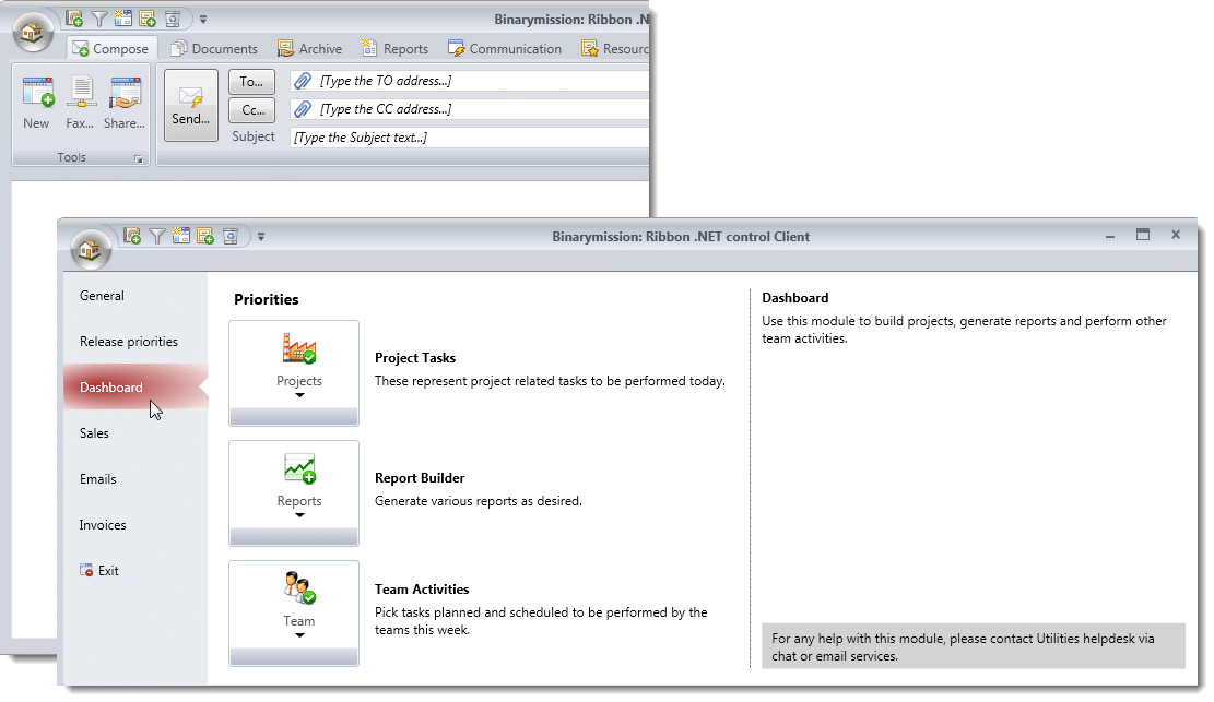
Binarymission Ribbon Control provides an out-of-the-box ability to let you add Office UI Ribbon style User Interfaces to your WPF .NET applications with ease in very less time.
The Control comes with several Office styled controls, including ComboBox, EditBox, Menu, MenuItem, Menu item overflow controls, and many more that you would find handy to use in your WPF applications.
Ready to use Office style "Application Window" control, including Application Menu and button
The control contains an Office styled modern application Window class that your Window classes can derive from, to render Office 2007 Windows.
This is instantly achieved simply by deriving your Window classes from our BinaryRibbon Window class.
The control also provides Office style Application menu and Application button controls.
It also provides all of the visual effects that Office 2007 ribbon applications render, viz., the gradient brush effect on the background of the Application button when the mouse enters its bounds, the glass style menu item background rendering, and many more.
Supports rendering Backstage view for application menu
You could switch to this menu mode by simply setting up your menu content inside the newly introduced control named BinaryRibbonBackstageApplicationMenu which is hosted as the value for the ApplicationMenu property of the BinaryRibbonBarPanel instance.
Advanced Custom Controls
The Ribbon control comes packaged with loads of custom controls (that you can use even outside of our ribbon control, of course).
The following screenshot of a sample demo WPF application using our Ribbon control shows off some of our many custom controls, including the SmartTextBox control that supports customisable water-marking of text (when the user has not yet input text into the control), alert clue flag visual within the control (to indicate some invalid input, etc.), and many more features.
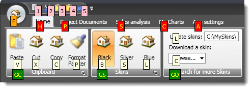
KeyTips brushes are configurable: Multi-colour keytips
By setting simple Attached properties, you will be able to customise the Background and Foreground brushes of the KeyTips on a per element basis.
Typically you would only want to keep the same color brush across all keytips, but there may be scenarios where you might want to highlight the keytips belonging to different UI elements differently, say for example, one color for keytips belonging to Tab items, and another color for keytips for elements within that tab item.