
SmartNavigator
A custom control that provides a modern way to present scrollable content in your applications.
Feature Highlights
- Modern & stylish Tab and List box controls
- Ready to use, right out-of-the-box
- Highly customisable in respect of colours and display orientation
- Out-of-the-box customised ControlTemplate and Style object
A quick peek into some features...
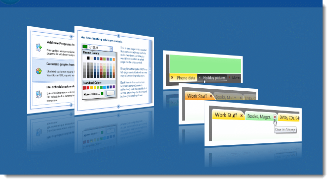
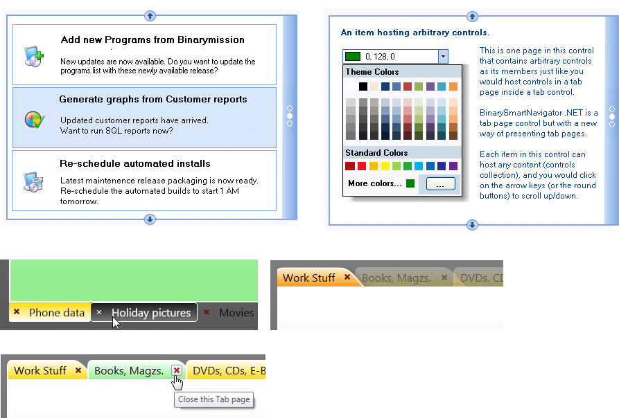
Modern Listbox and Tab controls
BinarySmartNavigator .NET can be visualized as a tab/listbox control but with a new way of presenting and scrolling the tab pages/list items.
Each item in this control can host any content (controls), and to scroll across items in the control you would click on the arrow keys (or the round buttons) to scroll up/down.
The control also provides page selection controls in its side bar, so that if the users needed to go to the last item (page) or first item (page) quickly, he could click on those controls to scroll to that item / page.
Highly customisable in respect of colours and display orientation
The controls provides simple to use properties that will let you set the colors for drawing the various UI elements, including the scroll buttons, item/page jump buttons in the side bar, the color of the sidebar, the item/page selection background color and its border color, the control’s border thickness and color.
You can of course write you own ListBoxItem control template, and host your ListBoxItem instances in our control to give a different look and feel to the items in the control, and continue to get our custom list box control UI and behaviour.
More related .NET Controls In The Package - ready for use
To make instant use of our custom WinForms ScrollBar control, the package contains some useful container controls that comes built-in with the Binarymission custom Scrollbar controls as their scroll bar, so you do not have to write or wire up any event/code.
These controls cover most of the use-cases of scrollbar usage as you will find below.
- Custom Scrollable Image viewer control
- Custom Scrollable Panel control
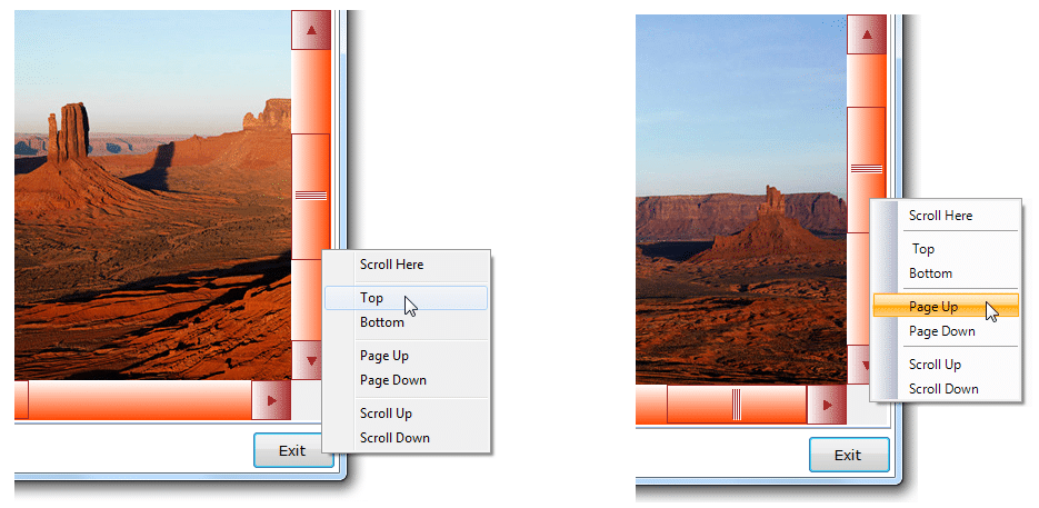
Supports Built-in Scrollbar ContextMenu
The controls, by default, provides a built-in context-menu that enables ready-to-execute commands for scrolling.
The built-in scroll commands context menu can be set to display in two modes:
Using standard ContextMenu component (figure 1)
Using Binarymission extended WinForms Menu component (figure 2)
But of course, you can switch-off the provided default context menu, and provide your own as well.
Instant replacement for the standard Scrollbar controls
This control instantly replaces the standard .NET WinForms VScrollBar and HScrollBar Controls.
It raises all the very same events (and even more than) that of the stock scrollbar controls raise, so it makes your life easier to use it in your applications.
Unlike the standard .NET ScrollBar controls, Binarymission custom Scrollbar controls allows you to custom configure all drawing / rendering aspects of the visual/control, without writing any code (unless you want to take more control, of course).
You can either choose to simply set the appropriate colour properties and set images to let the scroll bar render as you desire, or alternatively even take full control of drawing the core aspects of the control your self by plugging in your custom implementation of our renderer interfaces (more details elsewhere in this page).
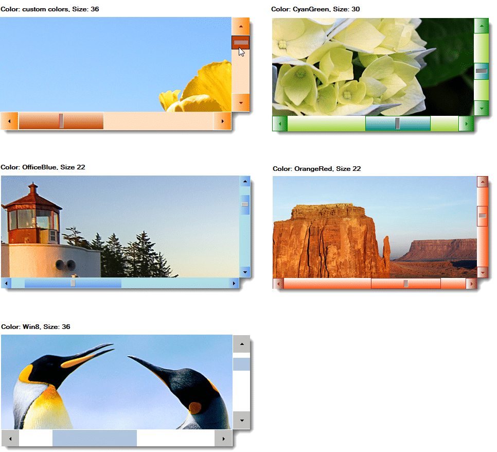
Comes with ready-to-use Window themes - just simply plug-and-play!
The component provides out-of-the box, the following styles of Window chrome rendering themes ready for use:
- Windows 10
- GradientBrown
- Office Blue
- Office Black
- Office Silver
- Olive
- CyanGreen
- OrangeRed
Custom pluggable Renderers
You could use the simple-to-use properties to set up all the colours size, etc, or alternatively, take full / partial control of drawing the various parts of the our custom scroll bar control easily, by plugging-in your own custom renderers.
No dependency on OS theme specific libraries such as uxtheme.dll, etc.
The component is completely custom written in order to provide (out-of-the-box) customisable drawing of the non-client areas, and hence there is no direct dependency on any OS theme specific libraries such as uxtheme.dll.
This means that you can use this library to present cool window forms applications with heavily customised non-client areas as you wish, across any Windows Operating system.
Full Customisation of look-and-feel
The controls expose simple properties that allow:
- customising the colours of every single aspect of the rendered artefacts viz., Thumb, Track and Scroll Arrow buttons
- customisation of colours for rendering various states like Hot, Pressed, Normal and Disabled
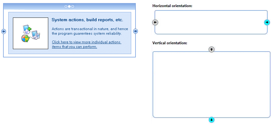
Orientation
The controls suite supports both orientations – Horizontal and Vertical.