A collection of various powerful and features-rich custom WPF .NET Controls
WPF Controls - Feature Highlights
Plenty of WPF .NET Controls, straight out-of-the-box
Full Customisation of look-and-feel
Rich design-time experience for development
Just drag-and-drop, and ready to use!
The Controls listed here are in addition to the many of the Controls listed in the Products page.
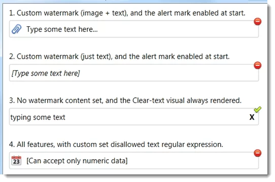
Watermark Textbox
SmartTextBox is a Watermark rendering capable Advanced TextBox control for WPF.
Core Features
1. Watermark display
The controls allows to set any content piece as its watermark (image, text, etc.), and be able to set a custom template to render it as well.
2. Expandable border
3. High levels of customisation
Dependency properties are available to set up rendering aspects of control background for invalid input Dependency properties to perform blinking borders, animating the background color rendering, and displaying an information tool tip
4. Alert visual rendering
The control has out-of-the-box ability to display visuals to hint the user about a validation error
5. Built-in Eraser control
This feature helps in visually being able to erase text data on the control
6. Supports a custom regular expression
This feature lets you decide what text can be allowed to be input by the user.
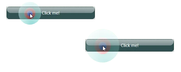
Bubble Control
Our bubble control is a custom WPF control that lets you provide wonderful visual feedback for a user action on UIElements.
The control works just like what we see in other OSs like Android, et al. and also in some Presentation software where-by you get the bubbling waves effect at the point of mouse clicks.
In our Bubble control, you will see a lots more extended effects, and you can even customise the various rings / waves / ripples of the bubble with your chosen custom brushes, and also be able to set the bubble sizing / expansion factor over time, etc.
You can apply the control’s bubble effect on any WPF UIElement.
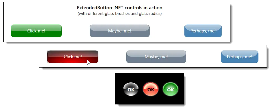
Advanced Effects / Extended Button controls
These are a collection of advanced button controls with extended rendering effects, including:
Glass rendering on the button
Extended animations supported: including one-off and continuous animation while the mouse pointer is on the button control
Configurable colours / brushes to suit your application needs
You can also configure the glass radius for glass rendering on the button
Both shapes of buttons supported, viz., Elliptical, and Rectangular buttons
Advanced ScrollViewer
The control extends the stock .NET ScrollViewer and implements some exotic custom new ControlTemplate and Styling, in order to provide really awesome features, including the following:
Allows setting up your own custom Width and Height (for Vertical and Horizontal scrollbars respectively)
Allows switching off drawing the Line Scroller visuals (at the each end of the scrollbars)
Lets you customise the Thumb’s corner radius, so that you can have any possible cool shapes of thumb
Allows you to specify if the scrollbars should overlay the scrolled content, in order to give an exotic aesthetic user-experience Allows to setup the Scrollbar track to be transparent to the scrolled/child content
Allows customising every single aspect of the artefact in the scrollbars to be customisable for colour brushes (includes being able to customise Line scrollers, Thumb, Track, etc.)
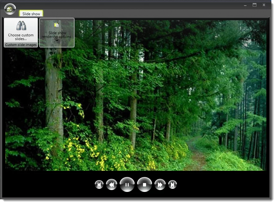
An image can speak for 1000 words… so take a look at our simply configured ScrollViewer control in action (as below):
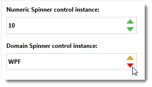
Stylish Numeric and Domain Spinner control
Supports customising border colour and the internal spin area rendering colours
Supports several mouse hovering effects
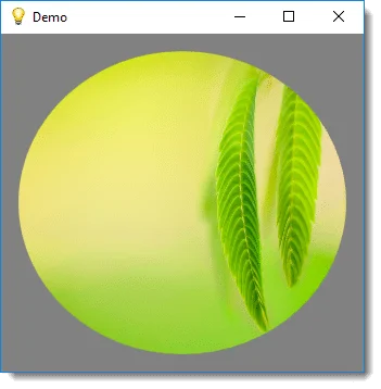
Rounded Corner Container Control
This is a specialised ContentControl for WPF, that can provide rounder corners or more advanced shapes to any content hosted inside it.
Features include:
Rounded corners around a host of child content FrameworkElement(s)
Automatically clips the edges of the child content along the rounded/shaped corners it provides
Supports Transparency around the clipped edges to make the rendered content look professional
Easy to use; simply host your complex content (UIElement(s) as the control’s content, and setup the desired corner radius
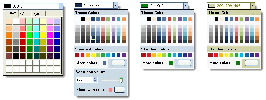
Office styled Colour Pickers
This is an Office style Colour picker control.
Features include:
MS Office style Colour picker window
Comes built-in with a “Flat” styled ColourPicker ComboBox, and Colour Picker DropDown controls
Configurable display styles
Dynamic Visuals Resizer
VisualsResizer is a run-time visuals (controls) re-sizer control for WPF..
What it does?
The control acts like a decorator on your application’s UI controls, and will instantly enable them to be dynamically re-sizable by your users, at run-time.
Features include:
Enables customising the rendering of the resizing visual
Enables automatic cursor change when the user moves the mouse over the re-sizing area
Enables re-sizing in all for directions
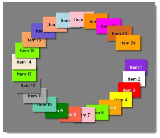
Radial Panel Control
What it does?
RadialPanel is a custom panel control that lays out its children items automatically in a circular fashion.
Features include:
Out-of-the-box ready to use Radial / Circular Layout panel
Render your circular fancy progress bars, gauges, carousel views in no time
Supports Data-binding
No procedural code needed to setup the control
MVVM pattern friendly
Use Cases include:
Circular progress reporting visuals like progress bars
Collection visuals like Carousel
Industrial Gauges to visualizes time or other real-time measurements
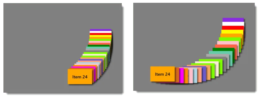
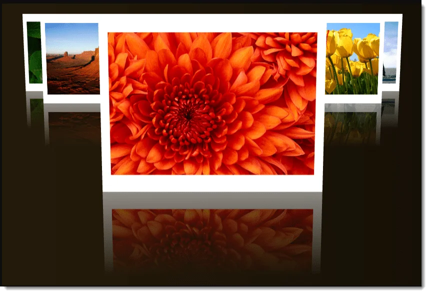
Carousel
Features include:
Powerful customisation options, including providing or customising:
a new Perspective camera for the Carousel
a new Perspective camera for the Carousels’ Viewport 3D
custom colour for the view port Ambient lighting
distance of the viewport Centre from the viewing user
gap between the currently displayed front item and others in the background
gap between items
Item rendering angle
Item’s size (dimension)
Enabling reflecting rendering
Powerful built-in Data-Templates for carousel item template
Powerful content hosting capabilities
No procedural code needed to setup the control
Pixel Shaders Library
A shaders library containing ready to use powerful and eye-candy slide transition effects.
The effects include:
Fade
Slide
SlideFromBottom
RotateFromTopLeftEdge
RotateFromCenter
SnowDustWipe
SlowBlurToNormal
BlurToNormal
BlurToNormalAndSnowDustWipe
Twirl
CircularTwirl
MonoChrome
Open
Wave
WipeRightToLeft
GlassWindow
Bands
Negative
WaterRipple
RainFloor, and many more.
Shared library
The WPF controls package comes with a Shared Library package as well, that gives you a lot of Utilityclasses and resources that you can use in your applications.