
TreeListView .NET
A custom Tree Grid . NET Control that merges the conventional TreeView and ListView style views into one merged view for displaying hierarchical data

Feature Highlights
- Unified Tree and List views in one Control
- Built-in features-rich Custom Control columns
- Drag and drop of nodes supported
- Multi-line text supported for Tree Column cell text
- Both Data-bound and unbound modes supported
- Tree-cell supports hosting checkbox / Radio button
- Allows customising node expand / collapse image
- Allows customising node connector line style
- Ability to support custom column position for the Tree
- Many more features!
More TreeListView features
The Control comes with many more features out of the box, including…
-
Columns can be frozen
-
Easily switch between Tree, List or Grid styles
-
Columns can be made visible / hidden
-
API to copy selected node content to Clipboard
-
Keyboard support for nodes expand / collapse
-
Multi-selection of nodes
-
Numerous events to enrich your application UX
-
Numerous useful APIs built-in including Expand/collapse node(s
-
And many more features!
A quick peek into some features...
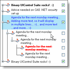
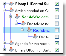
Unified Tree and List views in one Control
TreeListView is a custom .NET Control that brings to you a combined view of the well-known ideas of Tree and List styled views into one component, for displaying hierarchical data.
This means, you can now present a view to you users that they can
- Drill down just like a tree view, with nested nodes inside a parent node, and
- View other associated information about each node alongside the tree-column, just like a list view, thereby getting the best of both worlds.


Custom control columns provided out-of-the-box
Many custom column types are provided out of the box as part of the Control.
The column types include columns with many custom Controls, such as,: the multi-column combobox, DatePicker, Spinner, extended textbox, and many more.
Just by adding these specialised Control columns into the Control, you will be able to provide a very rich data view user-experience to your users, who will be able to select/set dates, type text, select items from rich-drop-down lists, and be able to perform many more data operations easily.
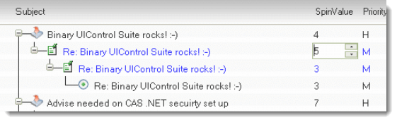
multi-line text in tree-list view column cell
The tree-list column’s cell supports multi-line text, seamlessly.
Your end-users can type multiple lines of text by hitting Enter keys whilst typing inside the tree-list-column cell.
You can also setup multi-line text in those cells at data load time.
Allows customising node connector line styling
You can setup a custom colour and also more complex styling for the nodes connector line.
The styles that can be customised includes, line thickness, line style (solid, dotted, etc.) amongst many other things.

Custom exotic Context menu with Group header
You can setup a customised content menu using our built-in advanced menu component which supports headers and sub-headers inside the context menu.
Customise the node styling to your heart's content
The tree-node object allows you to style it in any you want it to be displayed.
You can setup alternating colours for the node, background colour and/or text foreground colour and special colour on hover, node border colour, and many more..
Built-in Drag-And-Drop Of Nodes
Your users can drag-drop nodes from any level into another level of choice, at run-time. You do not have to write any code to get that feature.
Tree column can be placed in any position of your choice
The tree column can be placed both by your (at design time) and by your end-users (if you allow), at any column position of convenience.
Of course, this feature can be disabled for run-time, if you want, by simply setting up a boolean property.
Customise the node's expand / collapse image
You can setup custom image for the node. It does not stop there… you can setup different images, one for explanded state and one other for collapsed.
Can Customise column headers, row headers, and data rows
You can setup a custom colour and also more complex styling for the nodes connector line.
The styles that can be customised includes, line thickness, line style (solid, dotted, etc.) amongst many other things.