
Toggle Switch
for WinForms
Modern CheckBox and RadioButton .NET Controls

Feature Highlights
- Modern custom CheckBox & RadioButton .NET Controls
- Supports Windows 8, 10 style Toggle style UI
- Supports indeterminate/ nullable visual state
- Full customization of look-and-feel
- Supports mouse-hovering and other visual cue effects
- Many more features!
A quick peek into some features...
Exotic CheckBox, Radiobutton controls
ToggleSwitch .NET is an easily customizable custom Control for WinForms that provides an alternative way of displaying option display.
It is usual to use a Checkbox / RadioButton control as a visual interface to let end-users select one or many of the available options.
Many modern applications (including Microsoft Windows 10, iOS et al.) have a newer way of displaying option selection – i.e. by using a “switch” control UI that can be toggled between one state to another.
Our toggle-switch custom .NET Control provides you with just that kind of modern UI / UX for check-box and radio buttons.
Easy to use and customise
- Defaults already setup & ready to use: The Control comes with the standard defaults pre-configured, so you can simply instantiate the control and use it without any properties setup to perform
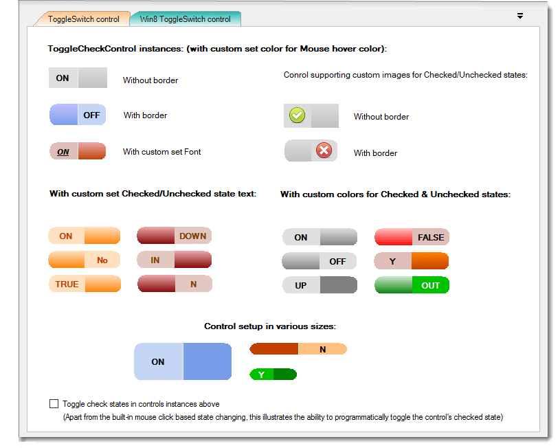
- Multiple presentation styles: The control supports styles such as the Modern Windows 10 / iOs style ToggleSwitch UI
- Supports both user-action and programmatic control: The Control’s visual state can be updated both via mouse action (i.e. click) and programmatic manner (via setting the control’s IsChecked property)
- Text customisation: The Control provides a convenient property to setup a custom text string for each toggle state in the control for display, for example Yes/No, Up/Down, etc, as may suit your application needs
- Localisation support: The toggle-state text property in the control is localisable, such that you can setup any custom language text.
- Easy to customise: Just use the properties on the control to customise all aspects easily: including the switcher text fore-colour, images, border colour, font, etc.
The Control also supports more additional capabilities, such as,
- Custom images for individual toggle states such as Checked and Unchecked.
With this feature, it is not necessary for you set a text value for toggle states. You could simply set appropriate images for each of the toggle state. - Custom colour for painting each of the toggled state section of the control
- Custom colour for rendering the background of the control upon mouse hovering
- The control also supports the Indeterminate (nullable-bool) toggle state