A highly customizable Tab Control for WinForms application, with many built-in themes, including styles resembling Google Chrome & Visual Studio, customizable Tab Page Headers, and many more features.
Feature Highlights
A highly customizable custom Tab .NET Control
Built-in themes, ready to use
Tab pages supports multiline text for headers
Configurable Tab pages overflow options
Features transparent background page
More powerful than the WinForms TabControl
Multiple styles of rendering the tab page header
Various orientations supported
Drag-and-drop of tab pages enabled
Visual Studio style tab pages "overflow" manager
Configurable Image display for page headers
... and many more features
Aquick peekinto some features...
Can host varying sized tab page headers and Tab page header images
The Control supports drawing tab page headers of varying sizes and shapes, including large tab headers.
Also you can setup large tab page header image for each tab.
TabControl Supports two rendering locations: Top and Bottom:
Image on Tab page headers - Supports displaying image on some headers, and no image on others
The Control lets you choose to have certain tab page headers to have image, and other pages to have just he text and / or other artefacts (like side bar, etc)
Supports Disabled state for tab page headers
The control lets you set any tab page header to be in a disabled state
The effect of this is that when a tab page instance IsHeaderEnabled property is set to false, the control will automatically:
Will not let users activate/display the disabled tab page content; the user’s click on the header will be ignored completely
Draw the tab page header text in disabled state
Draw the header image with its Disabled state image, if you had provided one. If you have not provided a specific disabled image, the control will compile automatically a disabled state version of the normal Image you have set for the header
Will skip drawing the close button on the page header (if you had set the control to draw close button on the page headers)
Automatic multi-line Header text drawing
By setting a simple property, you can ask the Control to render the page header containing long title text into multiple lines.
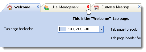
Close button rendering at tab page level (emulating IE, Google Chrome, FireFox, and many others.)
By setting an optional property, the Control can render a close button on each of the rendered & visible tab page headers, so your users can close the tab pages if they want to (and you allow it too).
The Close buttons can also be customized deep in terms of their fill colour, size and location in the page header.
Visual Studio style tab pages overflow manager, and tab page close button
Customisation of gradient direction / orientation for tab page header rendering
Easy customisation of Tab page header height
Extensively Customise the control's properties to your heart's content
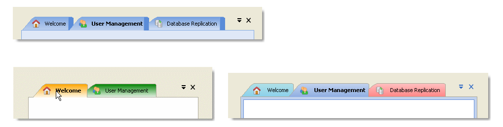
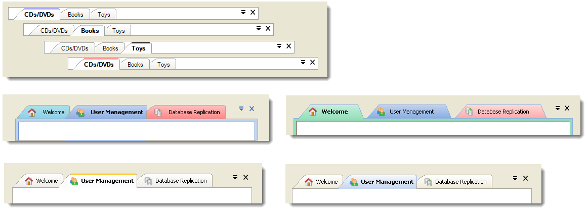
Built-in and Custom rendering styles
The control supports several built-in rendering styles that includes:
Visual Studio, (multiple versions), & Windows & XP styles
The control also supports a Custom styling mode for which you can set the start and end colour properties to render the tab pages.
There are further properties for controlling the rendering direction orientation, stylish sidebar drawing, border, and many other UI artefacts on the tab pages.
At the simplest level, you could simply drag-and-drop the tab strip control from the toolbox, add tab pages, choose a built-in rendering style (or choose the custom rendering style, and then set the tab page rendering colours), and finally add your content into the tab pages, and run your application, now powerfully tab enabled, all in a matter of few seconds.
You can achieve all the above, without ever having to write one single line of code.
Automatic Multi-line overflow of tabs
Automatic re-layout of tab pages upon resizing of the window / parent container
Out-of-the-box feature of auto sizing the tab page headers to be same across all tab pages


