
Borderless Form (Window)
A highly customizable borderless form custom .NET Window component, that supports being resizable and movable and lets you present your WinForms application windows in modern (and even highly customized) Window styles.
Feature Highlights
- Very advanced features, but very simple to use
- Visually design your forms with design-time support
- Supports true non-client area drawing
- Hosting .NET controls on the title bar section
- Enables you to render your own custom theme
- Plug-in your own custom chrome drawing if you desire
- Customize the Application Chrome Title bar height
- Customise window title bar background brush
- Can render as a chrome-less and resizeable window
- Transparent background rendering of non-client areas
- Customizable border rendering
- Customize application chrome command buttons
- Render custom sized Application Icon
- Gives you ready-to-use window rendering themes
- Sizing and moving behaviour supported
- No complex style editors or skinning involved
- No dependency on OS theme specific libraries
- Many more features!
A quick peek into some features...
What is ModernChromeWindow component?
ModernChromeWindow is a highly customisable WinForms .NET Form window component that lets you present your WinForms .NET application window(s) in a variety of modern looking Window styles – i.e. Microsoft Office, Windows 8, 10, and WinRT, and even in a custom style of your own by simply supplying your own values for various properties that the component exposes.
why would i want to use it?
If you wanted to move away from using the traditional looking Windows Form user-interface, and wanted your applications to have a modern look-and-feel, and at the same time you do not want to handle the complex low-level non-client area Win32 messages yourself, then you would want to use this component.
Essentially, with this component, you will be able to build heavily customized custom title bar / custom caption bar / custom border form based applications for WinForms, without you having to deal with the various complex low-level Win32 (non-client area) messages.
advanced features, yet very Simple to use
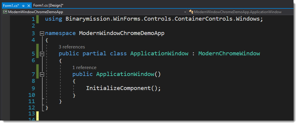
Simply derive from the ModernChromeWindow class instead of the standard .NET Form class, and you are ready to go.
This will render the default customisation predefined in the component – i.e. one of the built-in themes, viz., Office Black.
Of course, you can always set up all of the advanced customisation that the component offers on top of what you get by just deriving from ModernChromeWindow class.
Since the component derives from Form class and keeps all of its standard behaviour and provides additional behaviours on top (i.e. Sizing, Moving, etc.) the change to your code is only a one word change – i.e replace Form with ModernChromeWindow class.
No complex style editors or skinning involved
The customization provided by the component does not involve any kind of complex styling or skinning (or skin files) to be created.
All you need to do is either use the built-in drawing themes (like MS Office, Win 10, etc.) or provide your own values for the customisation, just simply by setting simple properties of the component in code or at design-time (via properties editor), just like the way you are normally used to with other standard .NET controls.
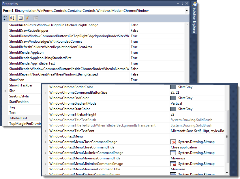
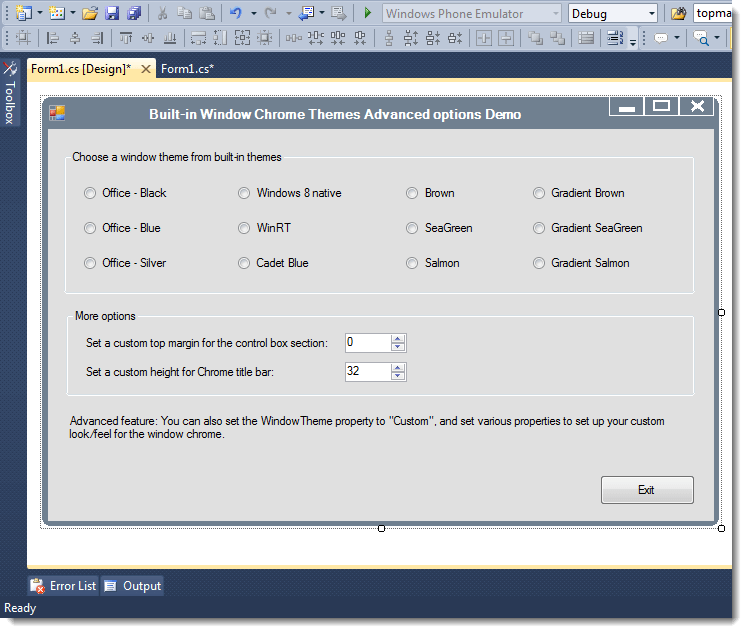
Customise the Application Chrome Title bar height
With this feature, you can set the non-client area / title bar section to any height that you desire – i.e. to a more larger or smaller than the standard 32-pixels unit height of Title bar area by simply setting the title bar height property.
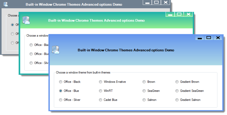
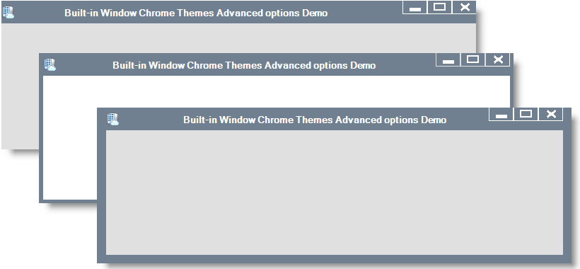
Comes with ready-to-use Window themes - just simply plug-and-play!
The component provides out-of-the box, the following styles of Window chrome rendering themes ready for use:
- VisualStudio - Light
- VisualStudio - Dark
- Office Blue
- Office Black
- Office Silver
- Win 8 Native
- WinRT (a.k.a. Metro)
- CadetBlue
- SandyBrown
- SeaGreen
- Salmon
- Many more!
Customise Window Chrome borders
The component allows you to customise:
- Border thickness (from absolutely no border, to all the way however much you desire)
- Border colour
You can Host .NET controls on the title bar section. Wahoo!
The component exposes a simple property that allows you to add any .NET control (standard .NET or even custom .NET controls) to be hosted on the non-client area / title bar area.
You can even specify exactly where in the title bar (in client co-ordinates) that the child control(s) should be rendered.
Your user can interact with these controls (on the title bar) as though they were hosted on the client area of the form.

Specify custom text alignment for your window title-bar text
You can set up a custom chosen text alignment for the window title-bar text as you desire, say for example: Left, Center or Right, by setting a simple property.
This property also allows setting up a custom string-format settings (text trimming, format-flags, etc.) of your choice to use, when formatting the text for the title-bar.
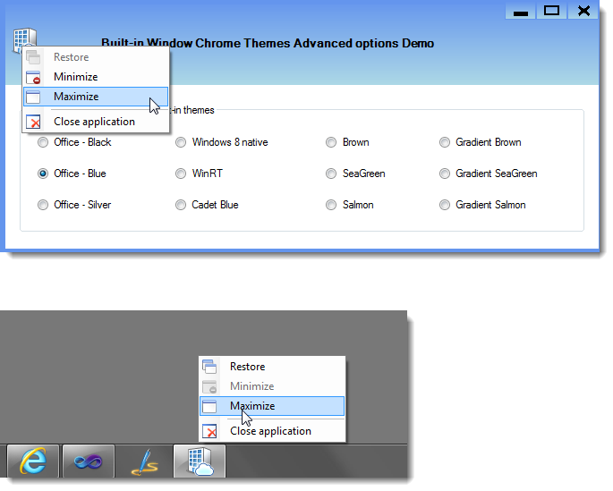
Provides system commands context menu, and support for custom Context menu
The component provides built-in mechanism to display system menu when your users right-click on the title bar area or the Application’s Task bar button (Right-click in earlier windows, and Shift + Right-click in Window Vista upwards)
You can also set up your custom context menu instance and supply that as the one that the control should display when the user right-clicks on the title bar or the app’s task bar button.
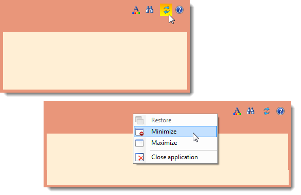
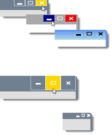
Customise Window Chrome command buttons images
A couple of options are available with this feature: Either you can…
- Use the default button painting and also have the ability to customise the colours for drawing it, Or
- Supply your own custom images for drawing the buttons (including support for setting up different button images for different visual states of the button such as Normal, Hot, Pressed, and Disabled)

Customise Window Chrome command buttons location in the chrome
By setting a simple margin property, you can set the location of where the command buttons will appear in the chrome.

Supports plugging-in your own custom chrome drawing and behaviour provider
In addition to the very rich feature of being able to host custom .NET controls on the non-client area (title bar section) as detailed in the point above, the control also lets you to completely draw the window’s chrome all by yourself.
Note that you need not use this advanced feature if you simply looking to host some .NET controls on the title bar, since in that scenario you can simply set up those controls through a simple CLR style property on the component.
But if you wanted to take control of painting the full window’s chrome by yourself, you could do so by using an additional rich mechanism as detailed below.
The component exposes an interface IModernWindowChromeProvider which you can implement to provide your own custom drawing of the chrome – i.e. the Border and the title bar contents – all by your own code, without worrying about handling the nuances of the complex Win32 non-client area messages.
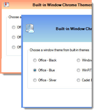
Effective Design-time experience
The component supports the Visual studio IDE design-time, so that it displays the non-client area (rendering and its behaviour) as-is in the designer view.
So, as you customise the property values of the component when in design time mode, you should see it appear in the view, so you can experience an effective WYSIWYG design-time experience.

Customise gap between command buttons
The tree-list column’s cell supports multi-line text, seamlessly.
Your end-users can type multiple lines of text by hitting Enter keys whilst typing inside the tree-list-column cell.
You can also setup multi-line text in those cells at data load time.
Can Customise the command buttons' visual states
You can customise many things, such as:
- Background/Fill colour
- Border colour
- Foreground colour
- Background colours for various visual states – i.e. different colours can be set for different states such as Normal, Hot, Pressed and Disabled
Button sizes: You could setup a custom size – be it larger or smaller, for the command buttons drawing.
customise application icon size on title bar
By setting a property, you can host a larger sized icon if your application has such a need.
You could think of using this feature by increasing the title bar area of the non-client area height, and could have a need to draw a larger sized Application icon at the left hand corner of the non-client area chrome.
Aside this, you can also set a property to specify whether the app icon should be drawn or not. This could be useful to change the visibility of the icon at run-time.
True non-client area drawing
The component draws into the real non-client area by making the appropriate calls into the Operating system to inform it of the intended non-client area that the system should honour as non-client area.
In other words, it does not simply fake by drawing something that looks like a non-client area in your Form client area, but rather actually provides you a real non-client area.
The component paints the real non-client area, by doing all the heavy-lifting of managing and responding to all relevant non-client area Win32 messages, and lets you simply set properties to help draw the chrome as you like.
No dependency on OS theme specific libraries such as uxtheme.dll, etc.
The component is completely custom written in order to provide (out-of-the-box) customisable drawing of the non-client areas, and hence there is no direct dependency on any OS theme specific libraries such as uxtheme.dll.
This means that you can use this library to present cool window forms applications with heavily customised non-client areas as you wish, across any Windows Operating system, including Windows XP, Vista, Windows 2003, Windows 2008, Windows 7 and Windows 10
Sizing and moving behaviour supported
Although the component by default makes the FormWindowState to Borderless window (thereby removing the standard Moving & Sizing behaviours provided by WinForms .NET Form class), the component provides its own custom implementation for sizing and moving the form window, so these behaviours are available regardless.
transparent background display of non-client areas
By setting up some simple Boolean properties, you can specify whether to draw the non-client area i.e. the title bar and / or the border, with their background drawn as transparent.
You can choose to either draw transparently the title bar only or even both title bar and the border.
The component also provides an additional property whereby you can set up the title bar text foreground brush so that the component can use it to draw the title text with that brush, specifically when you have asked it to draw the title bar background as transparent.
Can display as a chrome-less window, and still keeping it sizeable
The component also supports rendering the Form window instance without its chrome – i.e. it will draw its border (with a customized border size if need be), but with no title bar and no window command buttons on it and no way to move the window, but allowing the window to be re-sized.
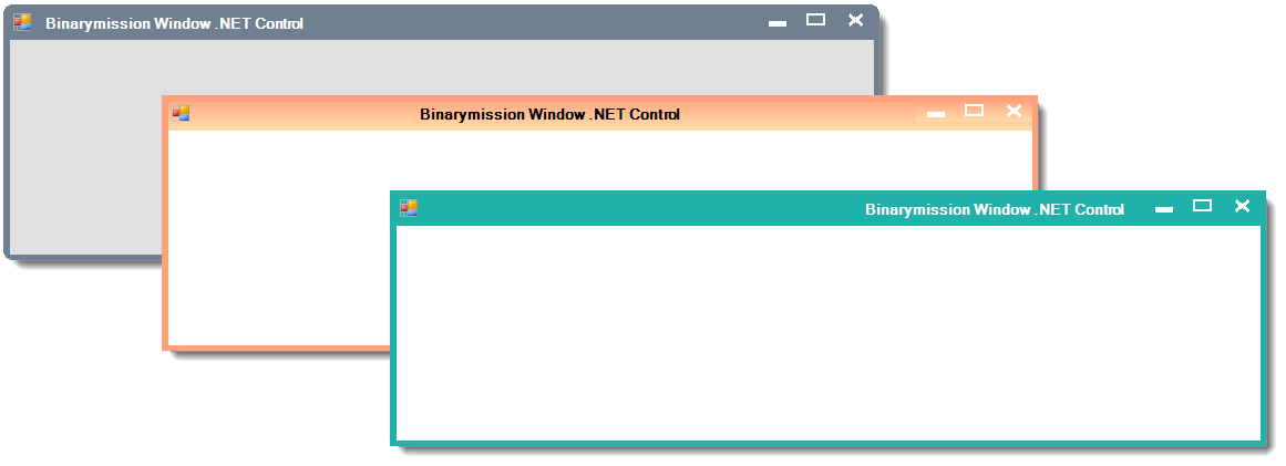
Customise Application Chrome Title bar background brush
With this feature, using some simple properties, you can set the brush (i.e. solid, linear gradient, texture, image brush etc.), brush colour, and the gradient mode (if need be), to draw the title bar section of the non-client area of the window.
Note that, by default the title bar and the border of the chrome are drawn using the same colour. But if you need, you could set two separate colours, one for drawing the window border and the other one for drawing the title bar background.
Window edges / corners customisation
The component allows you to specify how the window’s edges should be drawn – i.e. with curved edges or sharp rectangular corners. This can be done by setting a custom value to the curve edge radius value exposing property of the class.